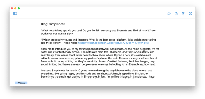
Simplenote
“What note-taking app do you use? Do you like it? I currently use Evernote and kind of hate it.” — co-worker on our internal slack
“Twitter productivity gurus and tinkerers. What is the best cross-platform, light-weight note-taking app these days?” — Noah Weiss
Allow me to introduce you to my favorite piece of software, Simplenote. As the name suggests, it’s for notes and it’s intentionally simple. The notes are plain text, shareable, and they sync instantly and seamlessly. This means that I never need to think about where I typed a note, it’s available and editable on my computer, my phone, my partner’s phone, the web. There are a very small number of features built on top of this, but they’re carefully chosen. Omitted features, like inline images, may sound limiting but there’s a reason people seem to always be looking for an Evernote replacement.
I’ve used Simplenote for nearly 10 years now and along the way it became the place where I put everything. Everything I type, besides code and emails/texts/chats, is typed into Simplenote. Sometimes the emails get drafted in Simplenote. In fact, I’m writing this post in Simplenote. I have thousands of notes, so I can’t list them all, but here’s a sample: every todo list I have, a grocery list shared with my partner, poetry I’ve liked, quotes, recipes, vacation planning, things I pack on every trip, a log of books I’ve read, books I want to read, frequent flyer account numbers, restaurants I want to go to, potential dog names, my sizes in various clothing brands, thoughts I want to remember but didn’t know what to do with, snippets of code, dinner party menus. The shared grocery list alone is worth it.
Simplenote is my goto example of a great user experience. I have a theory that the largest part of successful UX is that every UI element does exactly what you expect (no surprises!) and when you want to do something, your first guess is correct. Simplenote nails this and the simplicity is a big part of how. They’ve selected exactly the minimum feature set that people really need, which means those features can all be exposed in the most obvious way and yet it doesn’t end up cluttered.
The features, basically: tags, search, full revision history, read-only publishing to the web, sharing with other Simplenote accounts, markdown rendering, focus mode, and that’s about it. Just check out Noah’s list of requirements in the tweet I linked above, it matches almost perfectly.
My life is organized entirely in Simplenote. This has been the case since at least 2009, when I was working at Google and they gave out the first Android phones as holiday gifts. Like a good employee, I tried to switch, but at the time there was no native Android app and I had to switch back to iOS. Early Android had a lot of rough edges, but the one thing I couldn’t adapt to was the lack of Simplenote.
When syncing only works most of the time, it never completely fades from your headspace, but when it works every time, it stops being something that you worry about. Simplenote’s syncing works every time. In ~10 years, it’s glitched once and lost one set of edits to a single note. I remember this so clearly because for the rest of that time, I’ve never had to think about where I’ve typed something. It’s always in Simplenote.
My enthusiasm for Simplenote may sound like hyperbole, but it’s not. Official apps are available for Mac, iOS, Android, and the web. Try it out!
